Players are praising Odallus art a lot and many are drawing comparisons between Odallus and other NES games, claiming that Odallus is an authentic NES experience. Though this makes me really happy, since that was actually what I meant for Odallus’ art, I need to come clean about what really is NES accurate about Odallus, what isn’t and how this has guided most of my aesthetic choices.
When I started to think about Odallus art, back then in 2013, I had made up my mind I was going to stick with 8-bit aesthetic for practical and stylistic reasons. I knew that Odallus was going to be a huge up step up from Oniken in terms of level complexity, mechanics and gameplay. However, I also knew that Odallus had to be a step up in graphics as well. But if both games use 8-bit themed graphics how could I make Odallus better graphically? Sure, I was way more experienced in retro pixel art style since completing Oniken, but I also decided to not to be so fixed in NES capabilities as I was during Oniken. I wanted to get more of the NES feel but without being too restricted by technical stuff that didn’t add to the experience.
To understand better what NES feel was, I started to look into and play lots of original NES titles trying to figure exactly what makes them feel like they belong to the same console and different from something else, like for instance… Master System.
The first obvious reason is the color palette. NES had a limited and very characteristic palette with 64 colors and most of them… not so diverse. The NES palette offers a lot of blues and greens (cool) tones and very little reds, oranges and yellows (warm tones). Just look down and see there are three columns for blues, three for greens and even one for purple while there is only one each for magenta, red, orange and yellow.

NES palette
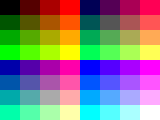
Master System palette
If you played a lot of NES games you will remember LOTS of games with awesome blues and greys on screen while very little warm colors being used, most of them in the main character to highlight it on screen. Master System has a more balanced color scheme, which results in different color choices for Master games.
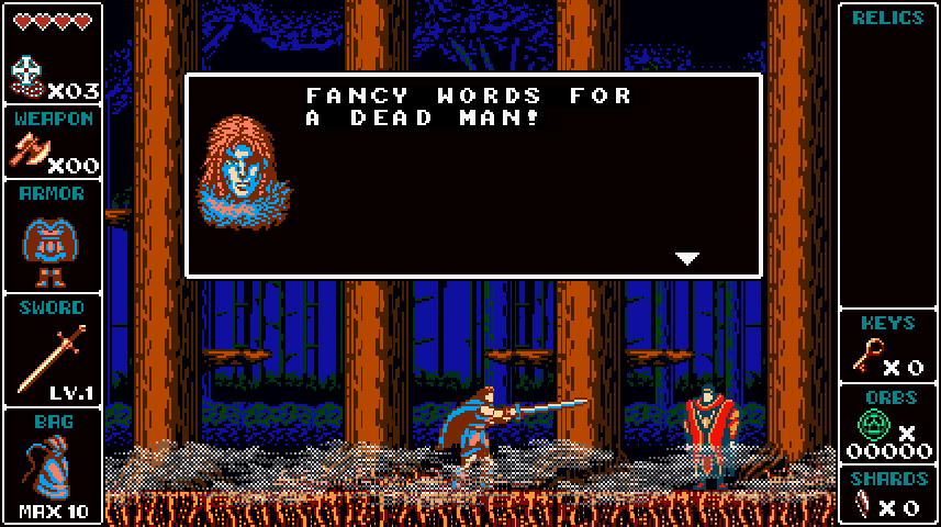
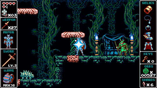
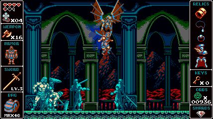
In Odallus I decided to make most background based on black shade in order to make the game look dark. Most of the backgrounds uses black as a “fill” color and you can floors near the surfaces, everything below fades into shadows. To standup agains this darkness, all characters have a outline and friendly characters have a brown outline while enemies have a dark blue one. I did this to make sure that they will pop even in pure black environments. The main character, Haggis, also feature less shadow details than the rest of characters because I wanted to the player to never lose him on screen with the rest of the action. He uses very solid and simple colors in comparison to the rest of the monsters and creatures almost as if he was highlighted.
The second obvious characteristic of a NES game is the size of the tiles. But what is a tile? Tiles are the image blocks that are used to compose an image. The backgrounds are generally a collage of many scenery blocks side by side creating the scene while characters are many tiles swapped really fast on in the top of the other creating the illusion of an animation. NES tile size limits were 8×8 or 8×16 pixels, it used both. But some artists of this time created art assets of a bigger resolution (say 16×16 or 32×32) and divided it on those smaller blocks. I decided to take the liberty of using 32×32 as standard since it gave me much more freedom for creating interesting patters. I will talk more about tile sizes and characters in a bit.
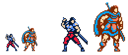
Beside size restrictions, tiles also bear another restriction on NES, which takes us to the other main characteristic of NES graphics. NES games have the limitation of 4 colors per tile, and if this tile is a character one of these colors must be the transparency. As a result, your protagonist and foes should have 3 colors at max.
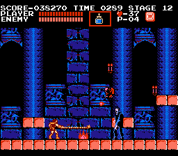
Vice: Project Doom (1991)
In the beginning of the NES era, games stick with that whatsoever, however in the end of that era developers created a work around this is a limitation: how about making a character out of two sprites, one on the top of the other at the same time? So the first sprite can use 3 colors (probably the dark colors) and one for transparency while another sprite is positioned right on the top of first one, which can have another 3 colors (generally the highlights) plus one for transparency. Games like Shatterhand and Gargoyle’s Quest II are some of the games that used that! To use more than 3 colors in many characters was too process consumer for the NES, so generally they used it only on main character or important bosses.
That’s why I have used 4 colors for Haggis while keeping 3 or 4 colors for backgrounds (most of them don’t need transparency anyways) and 3 colors for common enemies. Bosses sometimes had four colors and transparency even being very big sprites but I wanted bosses to be memorable so they deserved it.

Sometimes I just needed to get a better contrast for backgrounds that I coudn’t make with the original palette. In these rare cases I took a color from the palette and changed the gamma a little, just the gamma.
And at last, another very important step to emulate the NES style is to not use any effects that are too complex for that time, such as transparency, particles and alpha blends. I also avoided the super smooth “screen shake”. I’m not saying I don’t like those, I do, but none of the old system could do anything similar to that and, in my opinion, if you want to emulate the feel of an old system you should avoid them.
I did not used any semi-transparency effect and alpha blending, everything that was semi-transparent was made by using dithering or flickering, such as in the old days. You can see those on the dash shadows effect and double jump effect. I used very little particles and most of the were mannually generated without using any realistic physical engine. All the ingame physics was very simple and predictable. I also used pixel perfect movements for scrooling and animations.
Finally, for the screen aspect ratio I had some problems… In Oniken I used the 4:3 aspect for the nostalgia effect but after releasing and watching youtube videos it bothered me how much space I was missing in screen. That just felt wrong. But at the same I wanted to keep the old aspect ration old school feel.
So I decided to keep the game itself at the 4:3 ratio while using the previously unused space to store menu information. In this way, no space on the 4:3 area is wasted with HUDs while all the information that player needs are in the sides of the screen. This is one of the simple decisions I’m most proud of and I think that served just right for the gameplay. Also, I didn’t wanted to players pause the game to check their equipment or equipe something, so all in game upgrades are automatic too but that’s another story.
Those are the main limitations one has to respect to create an authentic NES feel in a game for what I observed while playing, but those aren’t all the NES limitations. Some restrictions I was completely aware of and still decided not to follow. In my opinion, these limitations are not much needed for the NES feel while skipping them adds so much visually to the game.
For starters, I have used lots of animation frames for sprites, way more NES can handle.
The game resolution is also way bigger, it is actually bigger than the PS1 resolution. NES used 256×240 resolution, PS1 used 320×240 and Odallus uses 428×240 (widescreen PS1 resolution). I can create more detailed and dramatic scenes with this resolution and also there is more space for Haggis and its foes to move.

Odallus resolution = 428×240

Castlevania 3 NES = 256×240
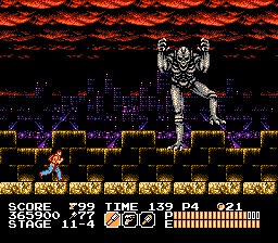
To make good use of this bigger resolution, character sprites are also bigger. They are roughly 16-bit system sized and there are lots of sprites in the screen at the same time without flickering. Bosses are also huge and made with lots of moving partes, this was impossible in the old NES, but I felt like bosses were something so special in this game that I could get away with a little cheating. (I’m not going to spoil boss design right now!)
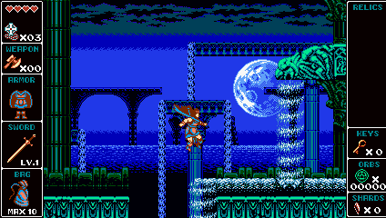
There is also lots of parallax effects, very similar to Genesis games, and NES couldn’t handle those advanced parallax effects neither. Parallax gives an sensation of perspective which environment (and thus, the game) becomes much more immersive.
As you guys can see I have chosen to skip a bunch of NES limitations, but it was always with the best intentions. I keep everything I thought to be necessary in order to keep the NES feel while bending some rules I thought weren’t adding to the atmosphere but rather tainting it. I hope that illustrates to everybody who enjoyed Odallus to understand in which ways it emulates a NES game and which ways it doesn’t as well as to help anyone that wanted to make your game feel like an NES game.